HI
Cube Validation
The quality of the HI line data was validated in multiple steps. We concentrate the analysis on cubes 0, 1, and 2 (see Table 2 in the “Available data products” document for the frequency ranges of the cubes), as the quality of cube 3 always followed that of cube 2 due to both of them being in adjacent low-RFI frequency ranges.
As a first step all cubes 0, 1, and 2 where the average rms noise was larger than 3 mJy/beam were rejected. Inspection of the cubes showed that such large noise values always indicates the presence of major artefacts in the cube.
We then constructed noise histograms for cubes 0, 1 and 2 of each observation and beam combination. We made no attempt to flag any sources prior to determining the noise histogram. The HI cubes are mostly empty (i.e. consist of noise pixels) and real sources have no discernible effect on the histogram. The only exception is that all cubes 0 were blanked below 1310 MHz to remove the impact of residual RFI at these frequencies.
We also extracted representative channels as well as position-velocity slices from each cube. The cubes of 14 observations (~550 cubes) were inspected by eye for the presence of artefacts and to gauge the impact and effect of data artefacts on the noise histograms.
Artefacts generally fell in two categories: due to imperfect continuum subtraction and due to imperfect sub-bands, which we discuss in turn.
- Continuum subtraction artefacts
Continuum subtraction artefacts (and with it the presence of residual grating rings) add broad wings with extreme positive and negative values to the noise histogram. Trial and error showed that these wings could be robustly detected by quantifying the fraction fex of the total number of pixels with an absolute value flux value >6.75σ where σ is the standard rms noise in the cube. While adding wings of extreme value pixels to the histogram, these artefacts in general do not affect the Gaussian shape of the central part of the histogram (i.e., at low σ values).
- Sub-band artefacts
The presence of sub-bands with lower quality (i.e., a higher noise) manifests itself not by wings of extreme pixels but by a systematic change in the shape of the histogram through the addition of “shoulders” to the histogram (lower kurtosis). Trial and error showed that the presence of these features were best detected by comparing the rms width of the histogram with that at the level of 0.8 percent of the maximum of the histogram. We define the parameter p0.8 or the ratio of this 0.8 percent width and the rms.
We compared our “good”, “bad” or “OK” rankings as determined by eye for the 14 observations with the corresponding fex and p0.8 values. This is illustrated in Figure 1 where we show the distribution of all cubes 2 in the fex-p0.8 plane with the cubes which we inspected by eye color coded to indicate their quality ranking.
“Good” cubes, i.e., those with no or very minor artefacts, were concentrated in a small part of parameter space obeying the following criteria:
- rms < 3 mJy/beam
- log(fex) < -5.30
- p0.8 < 0.25 fex + 5.875
A second criterion defines cubes of OK quality, containing some minor artefacts. This consists of cubes meeting the following conditions:
- rms < 3 mJy/beam
- -5.30 < log(fex) < -4.52
- p0.8 < 0.5 fex + 7.2
The upper limit of -4.52 of the second condition is not a hard limit and a slightly different value could also have been chosen. We found however that the values used here give a good compromise in minimizing the number of false qualifications of “OK” cubes
Cubes not obeying any of these two sets of criteria were considered “bad”.
Using these conditions we defined for all cubes 0, 1 and 2 a subset of good and OK cubes. Cube 3 in all cases follows the quality designation of cube 2.
Figure 2 shows the noise histograms and a representative channel map and position velocity slice for each of the three quality categories.
Whether a cube is part of the data release is determined by the quality criteria of the corresponding continuum image. This is described in more detail in the document “Released processed data products”. The quality of each cube and the metrics used to determine that quality are included in the VO table describing the released HI observations (see “User interfaces“).
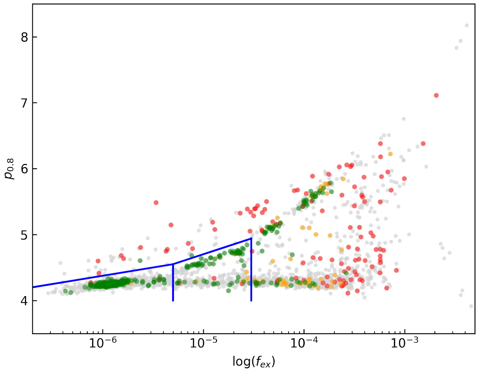
Figure 1. Distribution of cubes 2 of all beams in the fex-p0.8 plane (grey points). Overplotted are quality assessments of the beams of 14 observations. Good cubes are indicated by green points, OK by orange points and bad cubes by red points. The blue lines indicate the regions where cubes are considered good (left region) or OK (right region).
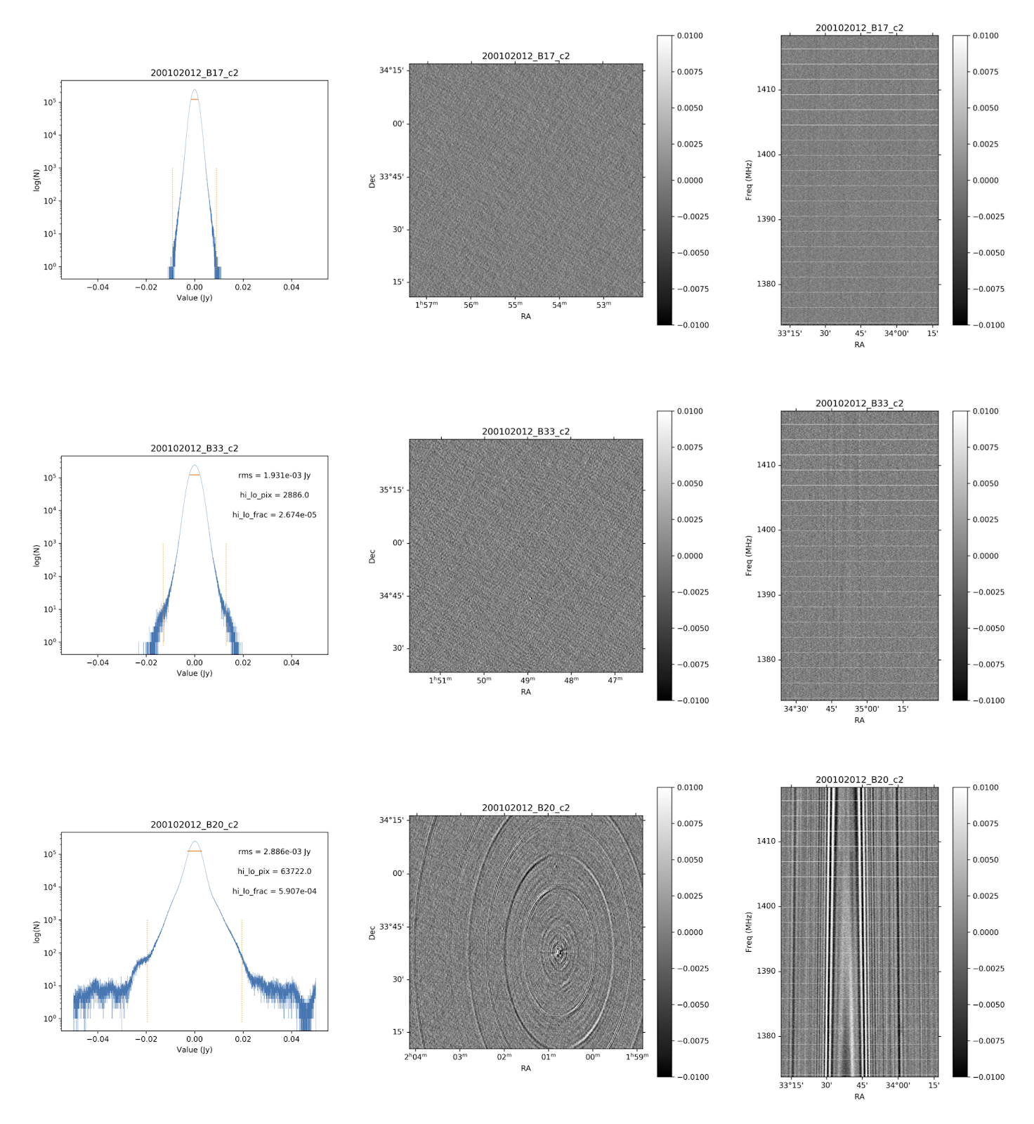
Figure 2. Examples of the three quality classes used for the HI quality assessment. The top row shows an example of a “good” observation (Obsid 200202012, beam 17, cube 2), the middle one an “OK” observation (Obsid 200202012, beam 33, cube 2) and the bottom one a “bad” observation (Obsid 200202012, beam 20, cube 2). The columns show, from left to right, the noise histogram, an extract of the central velocity channel, and a position-velocity diagram through the center of the cube. In the plots in the left column the short horizontal line at the top indicates the rms. The two dotted vertical lines indicate the ±6.75 x rms values. The “good” observation in the top row shows hardly any artefacts and a Gaussian noise histogram. The “OK” observation in the middle row shows a minor continuum subtraction artefact (which in turn causes somewhat extended wings to the noise histogram). The “bad” observation in the bottom row shows major continuum subtraction artefacts, resulting in a very non-Gaussian histogram.
External comparison
In order to further validate the line cubes, we performed preliminary source finding and cleaning of a subset of cubes using SoFiA-2 (Source Finding Application; Serra et al. 2015, https://github.com/SoFiA-Admin/SoFiA-2). Full details of this procedure are supplied in Hess et al. (in prep).
Comparison to ALFALFA
We compared the properties of HI detections in Apertif with the properties of HI detections in the ALFALFA catalogue (Haynes et al. 2018). We created a source catalogue with SoFiA and cross matched the detected sources with the ALFALFA catalogue. In 21 fields that overlap in the footprint of both surveys, we found 479 matching sources. Out of these, 336 sources were found in data cubes with “good” quality, 39 in data cubes with “OK” quality and 104 were found in “bad” quality data cubes. The results of the comparison are shown in figures 3 and 4. The color coding of these figures reflects the quality of the data cube in which the sources were identified with blue for “good”, green for “OK” and orange for “bad”.
Overall the properties of the Apertif detections agree well with the ALFALFA detections. There are some sources that have smaller line widths (w20) than the ALFALFA sources. This is likely connected to the flagging of 3 channels out of every 64 because of the strong dropoff in response (See “Aliasing” in “System notes”). Cubes 0, 1, and 2 have every three channels averaged together. Combined with the flagging of three channels out of every 64, this means that every 22nd channel in these cubes has no signal, and there are channels with ⅓ nominal sensitivity (periodicity of 42 and 21 channels) and ⅔ nominal sensitivity (periodicity of 63 channels). These flagged or partially flagged channels can result in a source being spectrally separated into two different detections. This then also results in smaller line widths for these sources. Another reason for the smaller line widths in Apertif can be extended emission detected in ALFALFA that gets filtered out by the interferometry.
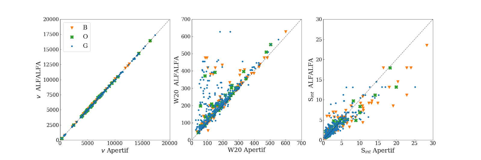
Figure 3. Comparing the properties of overlapping Apertif and ALFALFA sources. First panel: systemic velocity, second panel: W20 line width, third panel: integrated flux. The different colored markers represent sources detected in “good” (G), “OK” (O), and “bad” (B) quality HI data cubes.
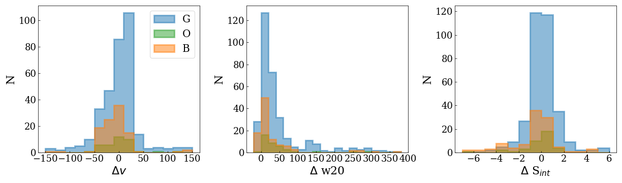
Figure 4. Distribution of the difference in systemic velocity, W20 and integrated flux between Apertif and ALFALFA detections. The colors represent detections in “good” (G), “OK” (O), and “bad” (B) quality HI data cubes.
SEE ALSO: